Designers are sometimes myopic. (Before you get defensive, you should know I’ve been designing for 20 years and I still include myself in that statement.) As designers, we tend to focus on our product but not the larger ecosystem in which it exists—even though almost everything we design is connected to other products or services. The problem is that many of those products and services are owned by a different part of our organization or developed and sold by an entirely different company. They’re out of our control, so we naturally focus our attention on what is in our control. We’re nearsighted and it makes us miss great design opportunities.
My Rental Car Experience
A recent experience renting a car drove me to think about this problem. While it may seem far removed from the design of software or web interfaces, the lessons learned still apply.
I travel regularly for work and the experience of reserving, picking up, and returning a rental car, to me, is still surprisingly easy and painless. At first, this trip was no exception. I arrived at the airport, boarded the shuttle, and the driver confirmed my “elite” membership. As we approached the lot, he told me the car’s location and dropped me off about 20 feet from the car. Talk about great service!
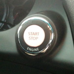
I always find the next part to be a little stressful—getting into a strange, new car. I sat in the driver’s seat and familiarized myself with the car. I found all the basic controls (side mirrors, headlights, and windshield wipers) and made sure I knew how they worked. Ready to go, I reached over to start the car (they always leave the key in the ignition). But there was no key. Even worse, there was no place to insert a key!—just a large white button.
As you may have guessed, this was my first time with a keyless ignition. Luckily, I enjoy figuring out how things work and I actually thought this would be fun (yes, in a design-geek sort of way). I looked around for the key fob, spotted it up on the dashboard, and put it in my coat pocket so I wouldn’t forget it. I turned my attention to the large white button labeled “START STOP” and pressed it once. The car turned on. Actually, the dashboard lit up but the engine didn’t start; the car was only in ACC mode. I pressed the button again, expecting it to behave like a traditional car (turn the key a little for ACC mode, then turn it more to start the engine). Instead of the engine starting as I expected, the dashboard lights went out and the car was now off. If a single-click didn’t work, perhaps it’s following a more modern computer paradigm and a double-click will work. So I tried quickly pressing the button twice. The dashboard lights came on—and went off again. I pressed it with short quick presses. I tried long slow presses. I varied the number of times I pressed the button. Once. Twice. Three times. Nothing. The engine would not start. I felt like I was attempting to crack a secret code.
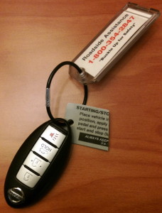
At this point, I have to admit I was starting to panic. I needed to get to a client appointment and didn’t know what else to try. I wasn’t ready to ask for help either—after all, starting the car is a simple basic task. I’m a designer, how could I admit that I can’t even start the car? I examined the key fob more closely and on the key ring, I noticed a small plastic card with instructions. But half of the card was missing! I was able to pick out a few key words—”apply” and “pedal” and at last, I had a clue. I stepped on the break pedal while pressing the ignition button twice—and the engine started.
Unfortunately, this wasn’t my only problem with the car. I didn’t realize it had an automatic toll pass installed—until I was approaching the toll. I had to lean over and read instructions explaining I had to “slide open the transponder box” to use it. But I couldn’t tell if it was open or not—at least not while driving down the highway at 60 mph.
I also attempted to charge my phone when I noticed the battery was low. I searched all around the center console for a plug, but eventually had to give up. As I later discovered, it was deep inside the center armrest storage area—impossible to find while driving. By now, I was so frustrated that all the good feelings I’d had about the rental car service were completely erased.
The Problem
As I said before, most of the rental car experience is pretty well designed: Easy online reservations, very helpful shuttle drivers, simple car pick-up, and quick car drop-off. As you may have noticed, these are all aspects of the experience that the rental car company controls. It’s the part that’s not under their control—the experience inside the car that’s the weakest point of their service. The rental car service has a fundamental connection and reliance upon the automobile—which is an external product designed by others. It’s the kind of connection we tend to ignore, when in fact it could be a great design opportunity.
There’s also another part to the problem. Car manufacturers are constantly improving their cars and have no problem introducing new features even if they’re surprising or disruptive to users. This is managed by having salesmen teach people how to use the car at the time of purchase. People then drive their car, usually every day, and quickly learn how to use the controls—even when they’re new and strange. This doesn’t happen when you rent a car and that’s part of the problem. The car and the sales process are designed to support car owners, not car renters. Features that are seen as improvements for owners become disruptive for renters.
Seeing Design Opportunity
So, if the design of the external product is out of our control, how do we go about designing the connection to that product? In this section, I’ll review two basic strategies.
Make a smoother connection. From the user’s perspective, connecting to an external product can often be a confusing experience. It’s like being in a strange or completely unfamiliar situation. You don’t know what to expect or what to do because you don’t have the necessary knowledge. You need a guide to help provide knowledge at the point of action and smooth the connection.
Does that mean we should design something like Clippy the paper clip? Absolutely not. Instead of a wizard or a help feature, we should provide the information and controls users need at the point of action—where and when it’s needed.
The rental car company was obviously aware of the problem with the ignition button because they included a small instruction card on the key fob. The problem is that the key fob is not at the point of action. Since there is no actual key, the fob can be placed anywhere in the car; it doesn’t have to be near the ignition button to start the car. When people have a problem, they are looking at the ignition button, not the fob. A better solution would be to place the information on a simple label at the point of action—next to the ignition button.
Similarly, information to help people get familiar with the car (headlights, wipers, toll pass, power port, etc.) should be available when you first enter the car. The information could be printed on a simple card and placed on one of the seats or hung from the rear view mirror. The information could also be provided to the user in a simple email, as a link to an interactive website, or even as a mobile app that provides a quick 30 second visual tour. The goal is to make the important information available when and where the user needs it—at the point of action.
I’ve mentioned a few ideas based on my individual experience, but what I’m trying to do is highlight the design opportunity, not recommend a solution. That would require a deeper understanding of the work practice across the user population, which should be done by going into the field, observing people, and talking to them about what they do.
If you look at desktop, web, or mobile applications, you’ll see the same problems and opportunities exist. Facebook automated the connection from external sites to their own site by allowing external websites to place a “Like” button on their pages. This allowed people to share content on Facebook—at the point of action. Apple’s visual voicemail removed hassle by automating the connection to your cell phone voicemail system and raising information about the messages directly to the phone—at the point of action. I could cite many more examples, but let’s move on to the second strategy.
Automate the connection. Connecting to an external product often comes with a lot of hassle. It’s as if there’s a huge wall between the two products that prevents information or actions from being passed between them. This wall can be removed by automating some or all of the connection between the two products.
In the case of rental cars, this strategy isn’t really an option. Services that automate the driving of the car already exist: They’re called taxis, shuttles, and limos. So let’s use a web example instead: Mint.com, an application for tracking personal finances. If you’ve ever tried other personal finance software, you know how difficult it is to get all your financial data into the application. You have to go to the website for each account, sign in, export your data as a file, import the file into your finance software, clean up the entries, and then repeat for each account (checking, credit card, loan, etc.). It’s an awful lot of work to connect to all these external accounts. Mint.com saw the design opportunity and automated the connections. The first time you use the application, it prompts you to input the login information for each of your financial accounts. It saves the information and then automatically pulls in the information from each account and provides one place to see all your financial information. Automating the connections to external accounts and removing that hassle was a big part of Mint.com’s success.
Look for Design Opportunities
So the next time you have to deal with an external product that’s connected to your design—even if you think it’s out of your control—don’t dismiss it. Instead, view it as an opportunity. Keep in mind that some opportunities will offer substantial benefits, while others won’t even be worth pursuing. Every situation won’t lead to a design breakthrough, but that’s not the point. Great design opportunities exist in these connections, but if you don’t look—you won’t find them.


