Today interaction design includes much more than what we see on our computer screens. It has a much wider impact on people’s everyday lives—even when they don’t own a computer. Because of this, we need to start thinking about interaction design as more than just buttons or functions arranged on a screen. Let me use Boston’s subway system to explain.
My 11 year old son and I were going to a Red Sox game, and since we live near Boston, we decided to use the MBTA subway system—or the “T” as we call it here. The new “CharlieCard” system had recently been rolled out, and I was excited to check it out. (Yes… I already know I’m a geek.) It was a big deal though, because the Charlie system replaced traditional subway tokens with new “Smart” cards.
When we arrived at the subway station, I saw new metal kiosks with touchscreens, standing throughout the entry area. I spotted one that wasn’t being used and guided my son toward it. With curious anticipation, I examined the kiosk. My goal was very simple—or so I thought. I wanted to buy four fares: two fares to go into Boston and two more to return after the ballgame.
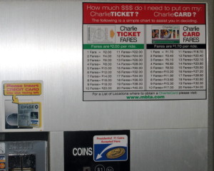
I looked around the station hoping to find an answer and I spotted an attendant, busily explaining the kiosk to other bewildered patrons. He noticed my distress and with an annoyed look, pointed to a piece of paper that I hadn’t noticed before—because it was taped to the upper right corner of the kiosk.
Why is the info taped onto the kiosk? Why isn’t it displayed on the screen? Why do I have to calculate my own fare? Why doesn’t the kiosk do it?
From the chart I figured out that four fares will cost $8.
(Note: The ad-hoc, hastily taped up charts have since been replaced with the professionally printed ones shown in the photo.)

Now back to the touch screen.
Should I choose $10 or $20? If I put extra money on the ticket, will I remember it the next time I ride the “T” or will I lose the ticket?
I decided it’s better to get the exact amount, so I picked “Other Amount.”

From there, I entered $8.00, and was instructed to make my payment. I found the correct slot and fed it a $20 bill. After a few seconds, it dispensed my hard-earned CharlieTicket!
Eager to be done with the kiosk, I grabbed the paper ticket and we headed for the turnstiles. As I was trying to figure out how to use the turnstiles (they were also new), the attendant noticed my son—and informed me that I don’t have to pay for him. Children under 12 are free, he said. Boy, that sure would have been nice to know before I bought the CharlieTicket!
Why is this so confusing and difficult?
We could easily blame it on usability problems, of which there are many. You can read an article from the Boston Globe or blog posts by Ashley McKee and Gregory Raiz. They describe in great detail the many usability and basic design problems of the whole Charlie system. While it’s tempting to believe that fixing all these smaller issues will solve everything, it only treats the symptoms—it doesn’t address the root of the problem.
The real problem is much deeper: The system model doesn’t match the user model. What do I mean by this? Well, when a system is built, its creators have a mental model of how they expect people to use it. Naturally, they build and structure the system according to that model, whether they realize it or not. But the user also has a mental model of how they expect to use the system, based on their own experiences. If the models match, the system is easy to use; if they don’t, the system is hard to use. And the greater the mismatch—the greater the difficulty.
This explains why the Charlie kiosk is so confusing and difficult to use. The system’s model of paying for the subway and my model are completely different. The system was designed to support adding money to a ticket or a card—but I think I’m just trying to buy four subway fares. The system wants to know how much money to put on the ticket—while I just want to know how much four fares will cost. The system expects me to reuse the ticket—but I’m going to throw it away when I’m done. And think about the impact of this—how many people do you think ride the Boston subway every day?
To address the root problem, we have to do more than fix the “surface” of the design. It will make no difference if we improve the usability of the interface, reduce the visual complexity of the kiosk, or even modify functions, because they don’t solve the model mismatch problem. To really solve the problem, we need to change the structure of the system and that means thinking differently about interaction design. We have to move beyond just arranging buttons and functions on a screen—we also need to understand people, how they think, how they work, and how they approach the tasks we support.
The system model is the core—it’s the structural foundation that supports the entire system. We should get this right before we start designing anything else.


